Custom Website Design for Canadian Businesses
NETLAB builds custom websites from scratch for Canadian businesses. Every design is mobile-first, responsive, and tailored to your brand -- no templates, no page builders, no pre-made themes. Our UI/UX design process includes wireframing, prototyping in Figma, and multiple rounds of revision before a single line of code is written. Starting at $999 CAD.
Why Custom Website Design Matters
Your website is the first impression most customers will have of your business. In a market where Canadian consumers research online before making purchasing decisions, a generic template website communicates that your business is generic too. Custom website design gives you complete control over how your brand is perceived, how visitors navigate your content, and how effectively your website converts browsers into customers.
Template-based websites built on platforms like Squarespace, Wix, or pre-made WordPress themes come with significant limitations. They load unnecessary code that slows down your page speed. They restrict your layout options to what the template designer anticipated. They produce websites that look identical to thousands of other businesses using the same theme. And they make it difficult to implement custom functionality like filtered product catalogs, interactive calculators, or dynamic content that responds to user behavior.
When we design a website from scratch, every element serves a purpose. The typography is chosen to reflect your brand personality and maximize readability. The color palette reinforces your brand identity and guides the eye toward calls to action. The spacing and layout create visual hierarchy so the most important content commands attention. Nothing is accidental, and nothing is there because a template put it there.
Custom design also means custom performance. Because we write only the code your website needs, our sites consistently score 90 and above on Google Lighthouse across performance, accessibility, best practices, and SEO. Template websites, loaded with unused CSS, JavaScript libraries, and plugin bloat, rarely achieve these scores without extensive optimization work that often costs more than building custom in the first place.
| Feature | Custom Design (NETLAB) | Template / Page Builder |
|---|---|---|
| Design Uniqueness | 100% unique to your brand | Shared with thousands of sites |
| Page Speed (Lighthouse) | 90-100 typical score | 40-70 typical score |
| Mobile Optimization | Designed mobile-first | Responsive afterthought |
| SEO Foundation | Semantic HTML, schema markup | Basic meta tags only |
| Custom Functionality | Unlimited, built to spec | Limited to available plugins |
| Code Ownership | You own everything | Locked to platform |
| Ongoing Costs | Hosting only (~$20/mo) | Platform fees + plugins ($30-100/mo) |
Our Design Process
Every project starts with a detailed discovery session. We learn about your business, your customers, your competitors, and your goals. We audit your existing website (if you have one), analyze your competitors' sites, and research the search terms your audience uses to find businesses like yours. This research informs every design decision that follows.
Before we design anything visual, we plan the structure. Wireframes map out every page, showing where headings, text, images, and calls to action will be placed. This is where we establish the user flow -- the path visitors take from landing on your site to completing the action you want them to take, whether that is filling out a contact form, making a purchase, or calling your office.
Once wireframes are approved, our designers create pixel-perfect mockups in Figma. You will see exactly how your website will look on mobile, tablet, and desktop -- with your real content, your brand colors, your images, and your typography. We build interactive prototypes so you can click through the experience and test the navigation before development begins.
Every project includes multiple rounds of design revisions. We present designs, gather your feedback, and iterate until you are completely satisfied. We do not rush this phase because getting the design right before development saves time, money, and frustration. Development only begins after you have signed off on the final designs.
Mobile-First Design Philosophy
Over 60% of web traffic in Canada now comes from mobile devices. Google uses mobile-first indexing, meaning it primarily uses the mobile version of your website to determine your search rankings. Despite this, many web design agencies still design for desktop first and then try to squeeze the layout onto smaller screens as an afterthought. The result is clunky mobile experiences with tiny text, buttons that are hard to tap, and layouts that require excessive scrolling.
Our mobile-first approach inverts this process. We design the mobile experience first, ensuring that navigation is thumb-friendly, text is readable without zooming, images are properly sized and optimized, and the most important content is immediately visible without scrolling. We then progressively enhance the layout for larger screens, adding multi-column layouts, larger images, and additional interactive elements that take advantage of the extra space.
This approach is not just about responsive CSS. It fundamentally changes how we think about content priority. On a small screen, you cannot show everything at once, which forces us to make strategic decisions about what matters most. These decisions produce better websites on every screen size because the content hierarchy is clear and intentional.
We test every design on real devices across multiple screen sizes -- not just the common breakpoints, but the actual phones, tablets, and laptops your customers use. Our testing matrix includes iPhone SE through iPhone 15 Pro Max, Samsung Galaxy devices, iPad, and desktop resolutions from 1280px to ultrawide displays.
Design Tools & Technologies
Website Design Projects
Here are a few examples of custom responsive websites we have designed and built for Canadian businesses.
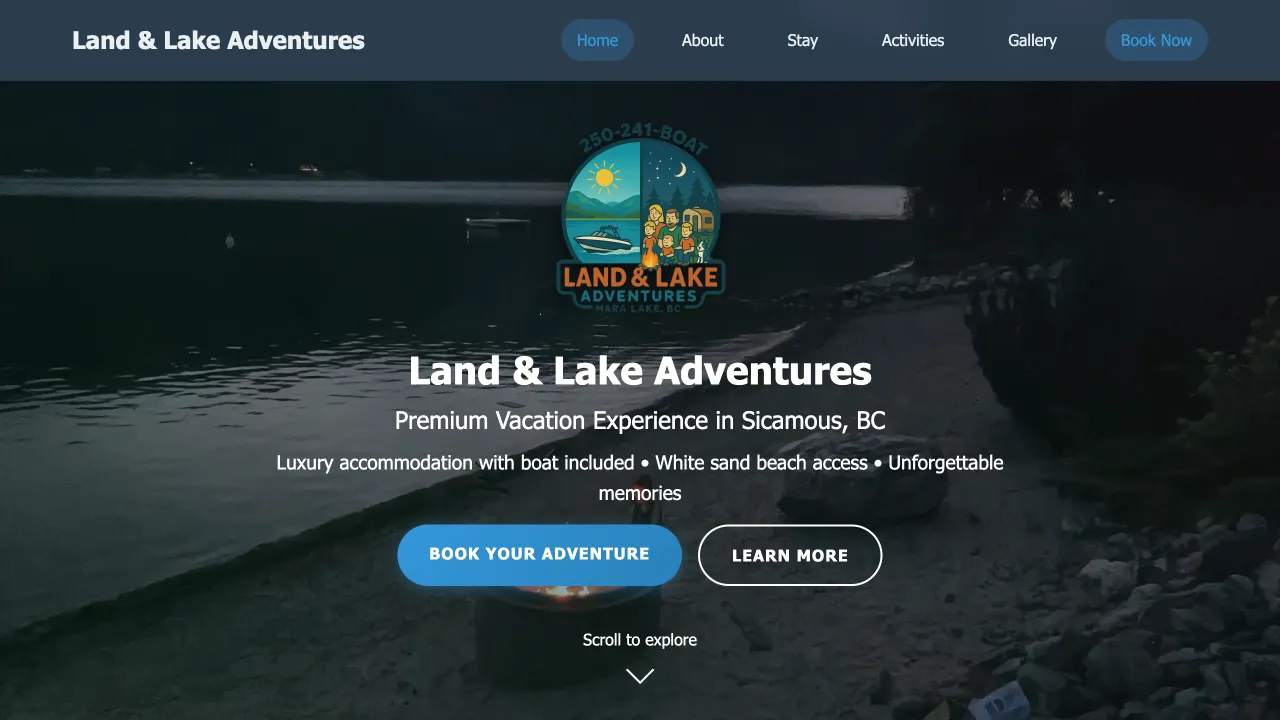
Land & Lake Adventures
Single-page responsive website for booking luxury accommodations.
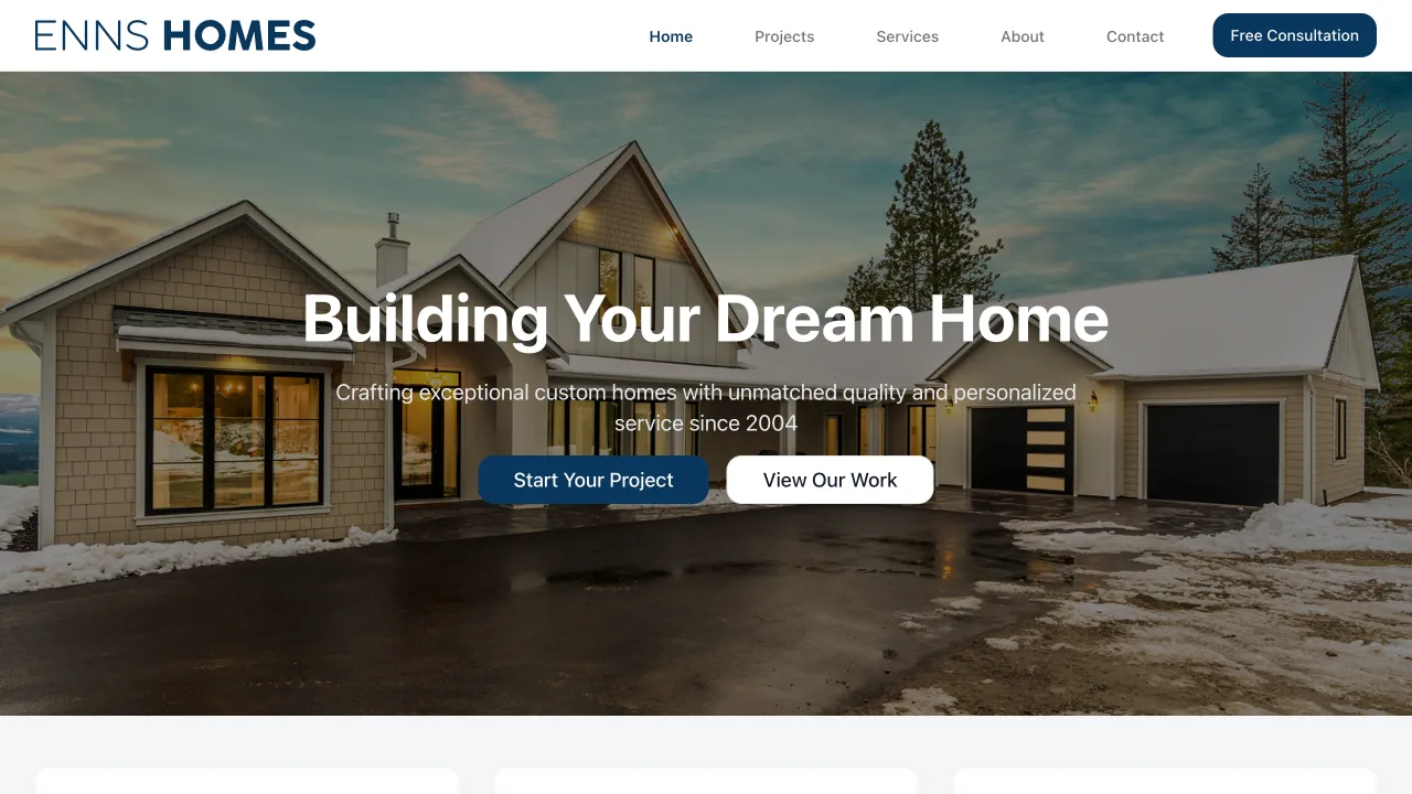
Enns Homes
Responsive website for a home building company showcasing projects, services, media, and contact links.
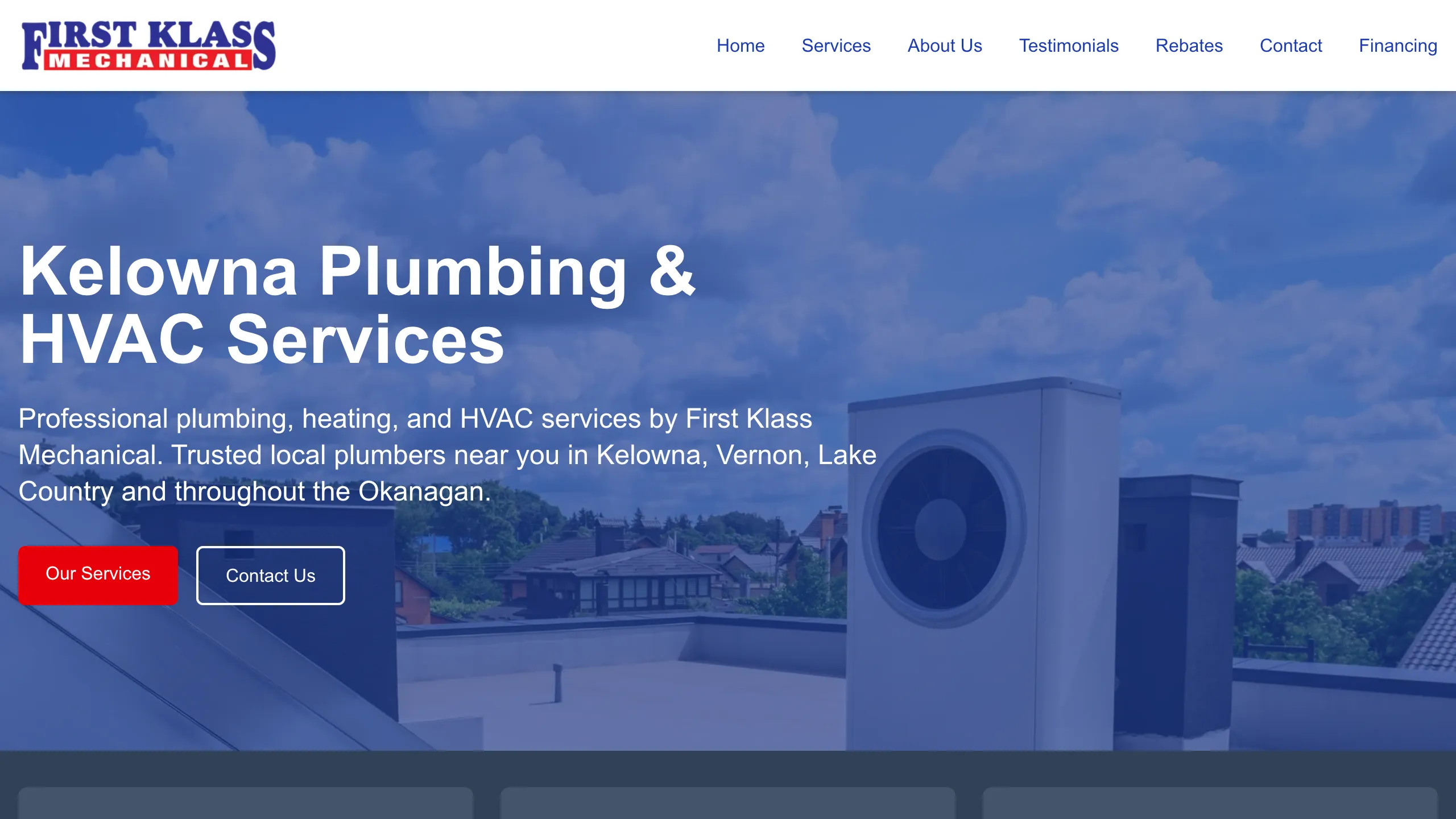
First Klass Mechanical
Kelowna, BC's premiere plumbing and HVAC service for over 30 years.
Frequently Asked Questions
How much does custom website design cost in Canada?
Custom website design at NETLAB starts at $999 CAD for a single-page responsive website. Multi-page business websites typically range from $2,500 to $7,500, depending on the number of pages, complexity of the design, and any custom functionality required. E-commerce websites and web applications with custom backends start at $5,000. Every project includes custom UI/UX design, mobile-first responsive development, SEO setup, and deployment to edge hosting.
How long does it take to design a website?
A typical custom website design takes 2 to 8 weeks from initial consultation to launch. Single-page websites can be completed in as little as 2 weeks. Multi-page business websites usually take 4 to 6 weeks. Complex projects with custom applications or e-commerce functionality may take 8 to 12 weeks. The timeline depends on the scope of the project, the speed of client feedback during the review process, and any third-party integrations required.
Do you use templates or page builders?
No. Every website we build starts from a blank canvas. We do not use WordPress themes, Squarespace templates, Wix drag-and-drop builders, or any pre-made design kits. Our designers create custom wireframes and high-fidelity mockups in Figma tailored specifically to your brand, your audience, and your business goals. This approach produces websites that are faster, more unique, and fully optimized for conversions.
What is mobile-first design?
Mobile-first design is an approach where we design the mobile version of your website before the desktop version. Since over 60% of web traffic in Canada comes from mobile devices, and Google uses mobile-first indexing to rank websites, designing for mobile screens first ensures that the most common user experience is optimized from the start. We then progressively enhance the layout for tablet and desktop screens.
Can I see designs before development starts?
Absolutely. Every project goes through a structured design phase before any code is written. You will receive interactive Figma prototypes that let you click through the full user experience on both mobile and desktop. We include multiple rounds of revisions in every project so you can provide feedback and request changes. Development only begins once you have approved the final designs.
Do you design logos and brand identities?
Yes. While our primary focus is website design and development, we offer brand identity packages that include logo design, color palette selection, typography guidelines, and brand style guides. If you already have an established brand, we design your website to align perfectly with your existing identity. If you are starting fresh, we can build your brand and website together as a cohesive package.
Ready to Start Your Project?
Get a custom website design that represents your brand, converts visitors, and outperforms your competitors. Contact us for a free consultation and detailed quote.